Hello Holland
Hello Holland is a complete redesign of an outdated Dutch e-commerce website. The goal was to transform a cluttered, text-heavy interface into a clean, modern, and emotionally appealing shopping experience. The redesign focuses on clarity, efficient navigation, and a stronger visual identity inspired by Dutch culture, but with a contemporary, minimalistic twist.
This project was part of the Interaction Design II course and required applying official design patterns from Designing Interfaces (Tidwell), focusing on navigation, layout, lists, user input, and interaction dynamics.
[PROJECT]
Interaction Design II
[MY ROLE]
UI/UX Design, Expert Review, Interaction Design, Visual Identity
[TOOLS]
Figma, Illustrator, UI Design Patterns
[Challenge]
The redesign focused on transforming an outdated e-commerce website with unclear navigation, overwhelming text blocks, and inconsistent layout. The main challenge was to reorganize the experience into a structured, modern, and intuitive interface while applying correct design patterns to improve product discovery, filtering, and overall usability.
[Goal]
- Improve product discovery through clear filtering and sorting
- Establish a modern and consistent visual identity
- Enhance overall usability with a structured layout and intuitive navigation
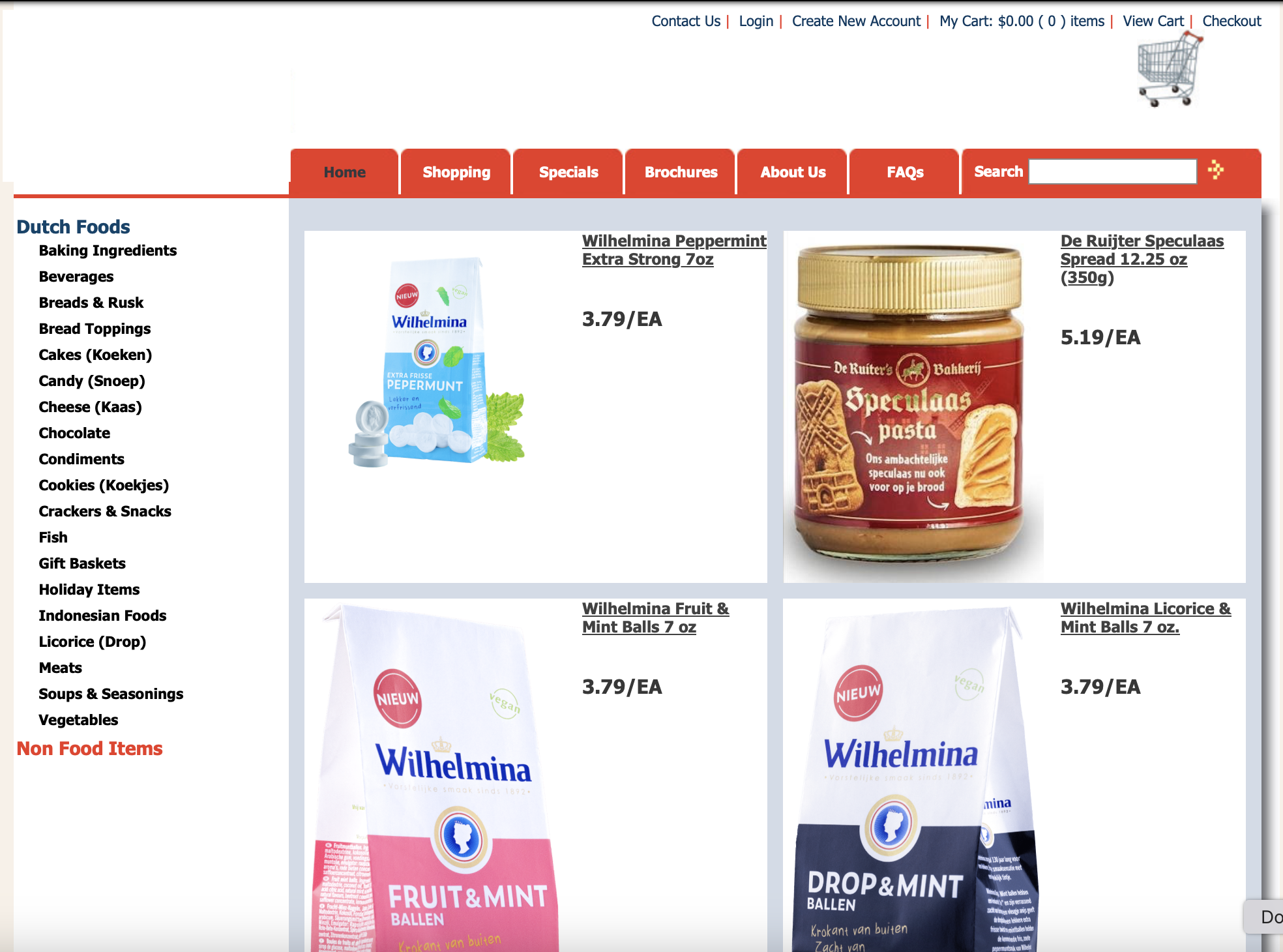
Original website layout (brand name removed for copyright reasons)
[My Process]
> Initial Analysis
Analyzed the original website to identify usability issues such as cluttered navigation, inconsistent layout, overwhelming text blocks, and lack of visual hierarchy.
> Pattern Selection
Selected appropriate UI patterns from Designing Interfaces (Tidwell), focusing on navigation, layout, lists, and user input to guide the redesign.
> Information Architecture
Redefined the structure of categories and navigation to improve product discoverability and create a more intuitive browsing flow.
> Wireframes & Interaction Flow
Developed low-fidelity sketches to explore layout possibilities and streamline filtering, sorting, and product exploration.
> High-Fidelity Design
Created a clean, modern, and minimalistic interface inspired by Dutch cultural elements, applying consistent visual identity across pages.
> Iteration & Refinement
Improved spacing, hierarchy, and interaction details based on feedback and expert critique to ensure clarity and usability.
Pattern 1 - Menu Page
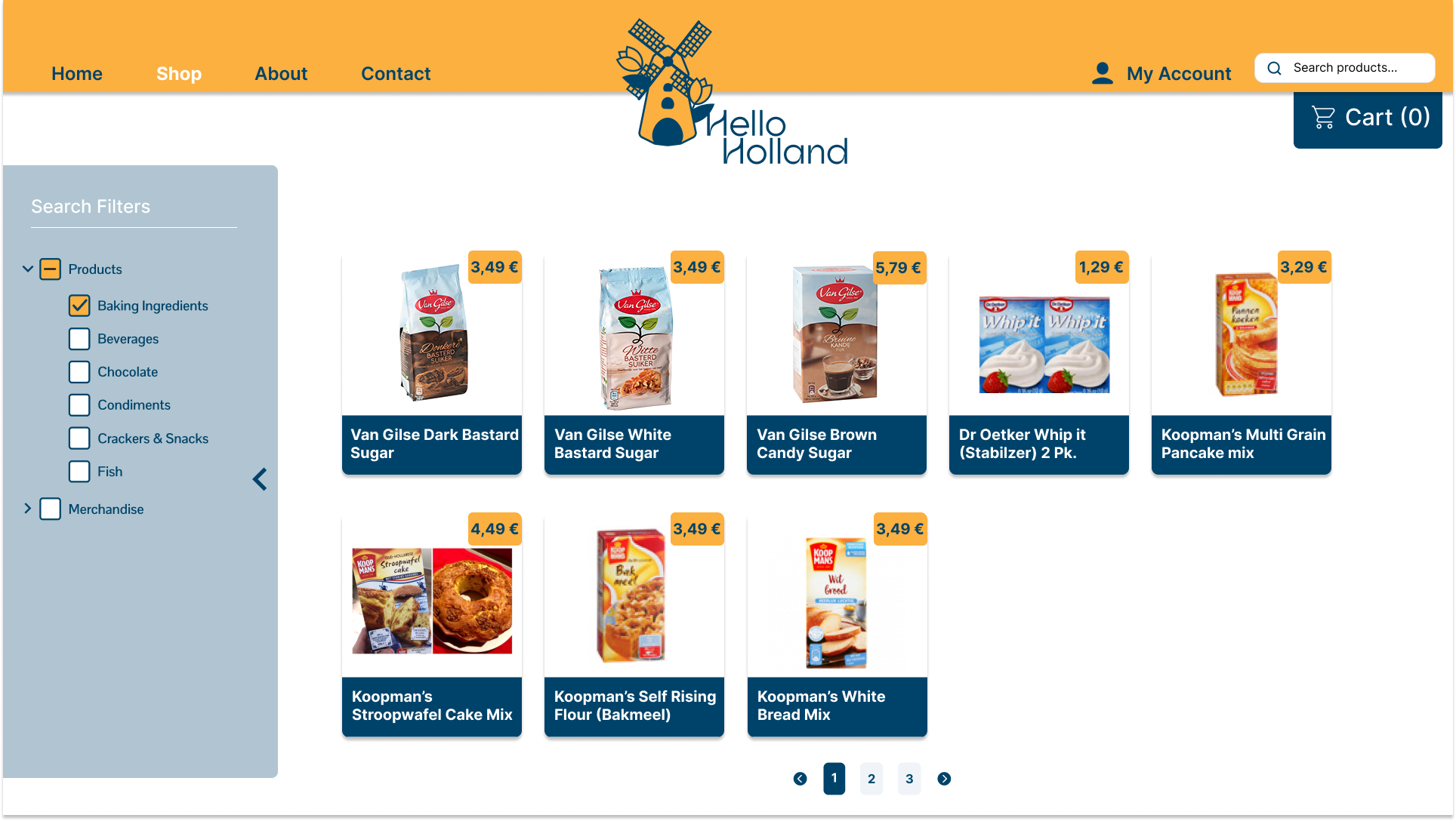
One of the main design decisions I made was to reduce information overload by limiting the number of categories and creating a cleaner, more organized filtering system.
Pattern 2 — Grid Layout
I enhanced the grid layout by using larger product images and a cleaner, more readable structure. The product cards focus on essential information only, displaying the product name and highlighting the price in yellow to strengthen visual hierarchy and improve scanability.
Pattern 3 - Tiled Product List
The original text-heavy vertical list was redesigned into a tiled card layout with large product images, clear naming, and highlighted pricing, enabling faster visual scanning and easier product comparison.
Pattern 4 – White Space & Spacing
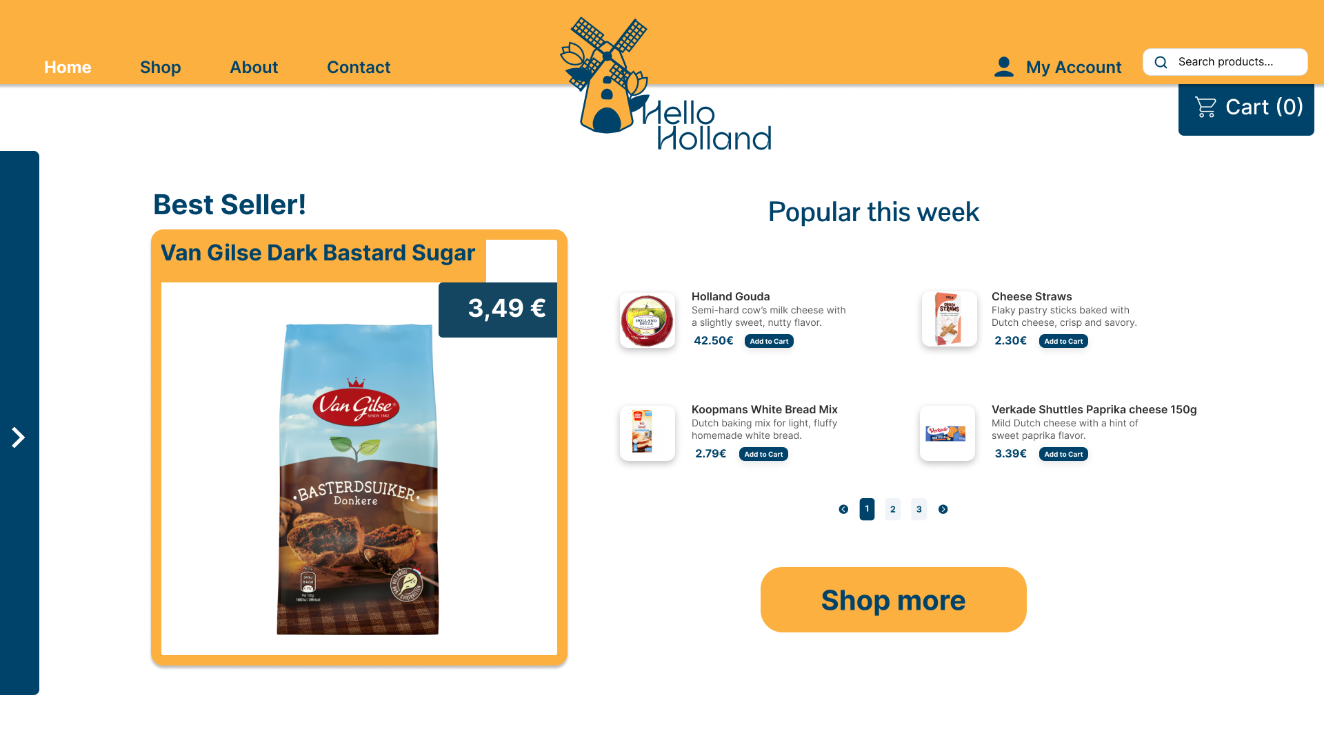
For this pattern, I increased the padding and spacing between key elements to reduce visual clutter. The use of white space enhances readability, improves content hierarchy, and gives the webshop a cleaner, more modern appearance.
Pattern 5 - Pagination
I designed the pagination to clearly highlight the current page using a distinct color, improving visual feedback and helping users understand their position within the navigation flow more easily.
Pattern 6 — Escape Hatch (Breadcrumbs)
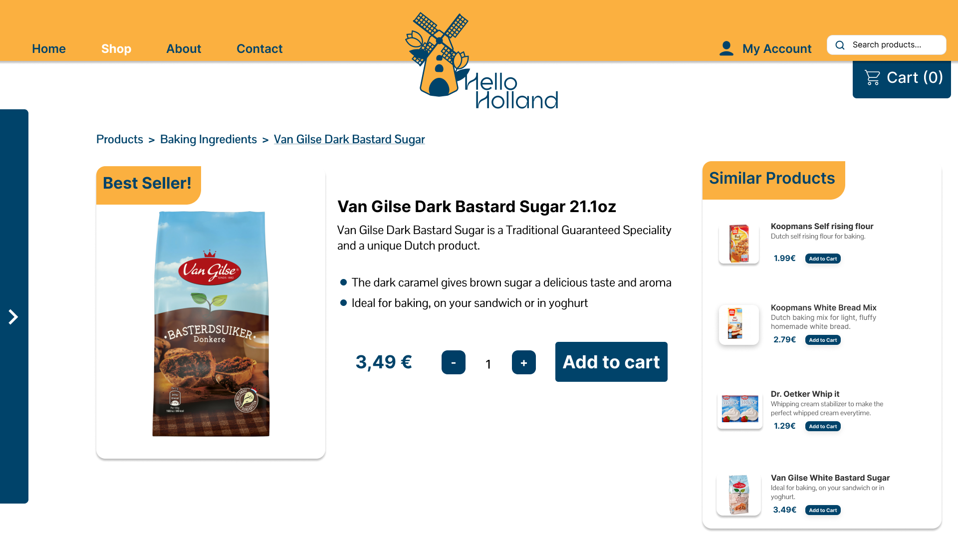
To improve navigation and reduce the feeling of being "stuck" on a page, I added breadcrumbs above the product title. This allows users to return easily to broader categories such as "Products" or "Baking Ingredients," creating a smoother and more intuitive navigation experience.
Pattern 7 — Button Groups
I prioritized the "Add to Cart" button as the primary action and removed unnecessary secondary buttons to keep the layout clean, focused, and user-centered.
Pattern 8 — Disabled Irrelevant
Instead of allowing the quantity to start at zero, I set the default value to 1, since adding "zero" items to the cart does not make sense. This decision reduces friction and prevents invalid user actions.
Pattern 9 – Input Hints
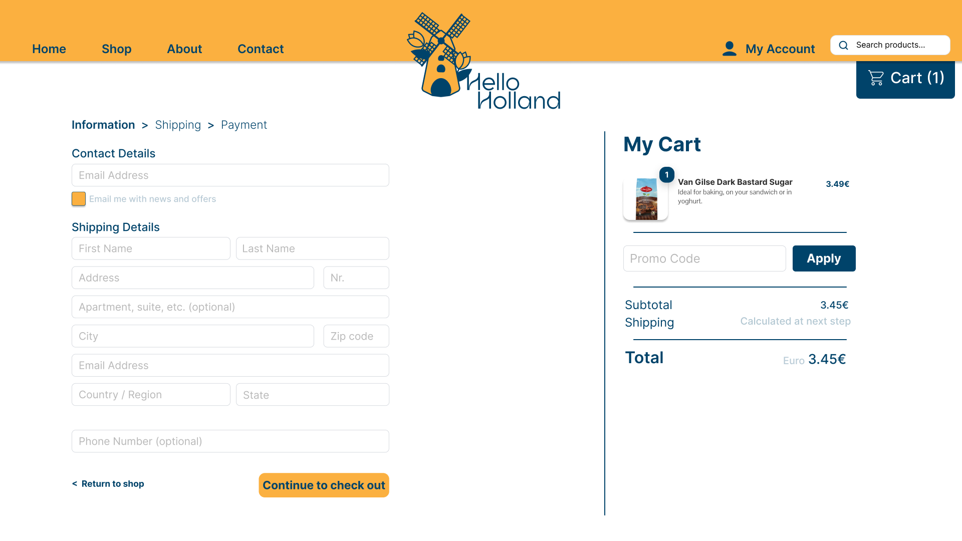
Input hints were applied only in the search field and checkout form, offering guidance at the right moment without cluttering the browsing experience.
Style Tile — Visual Identity Overview
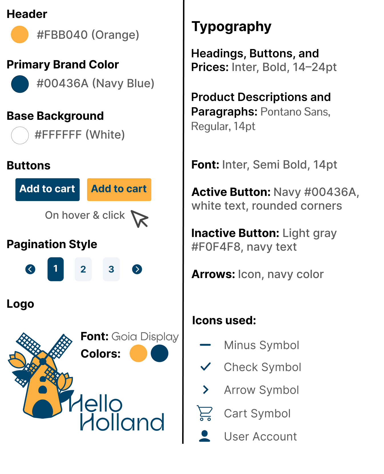
This style tile defines the core visual language of the redesigned Hello Holland webshop. It establishes the color palette, typography, button styles, and icon system that guide consistency across all screens. The choices focus on clarity, hierarchy, and usability, using warm brand colors, strong contrast, and a clean type pairing (Inter + Pontano Sans) to support a friendly and modern shopping experience.