Running Device

This project is from the Build & Test Prototype course. In this course, we were given multiple design projects. It covers UI/UX Design, Low to High fidelity prototyping, Heuristic Evaluation, Usability Test, Desirability Test, Heuristic Evaluation, A/B test, and Experience Design (Wizard of OZ).
[PROJECT]
Course "Build & Test Prototype"
[MY ROLE]
UI/UX Design, Usability Testing, Iteration
[TOOLS]
Figma
[Challenge]
The design project that we were given was to:
Develop a small-screen user interface for a running application that allows users to track essential metrics, start and pause their runs effortlessly, and stay motivated.
This required us to address key user pain points, such as minimizing cognitive load during physical activity and ensuring real-time feedback for motivation. Additionally, the interface needed to be intuitive, visually engaging, and easy to operate on the go, even with minimal attention.
[Goal]
- Clearly displays distance, heart rate, and running time in real-time.
- Provides a dashboard showing weekly, monthly, and yearly progress.
- Features easy-to-understand controls for starting, pausing, and ending a run.
What did I do?
First paper sketch

Paper prototype mockup
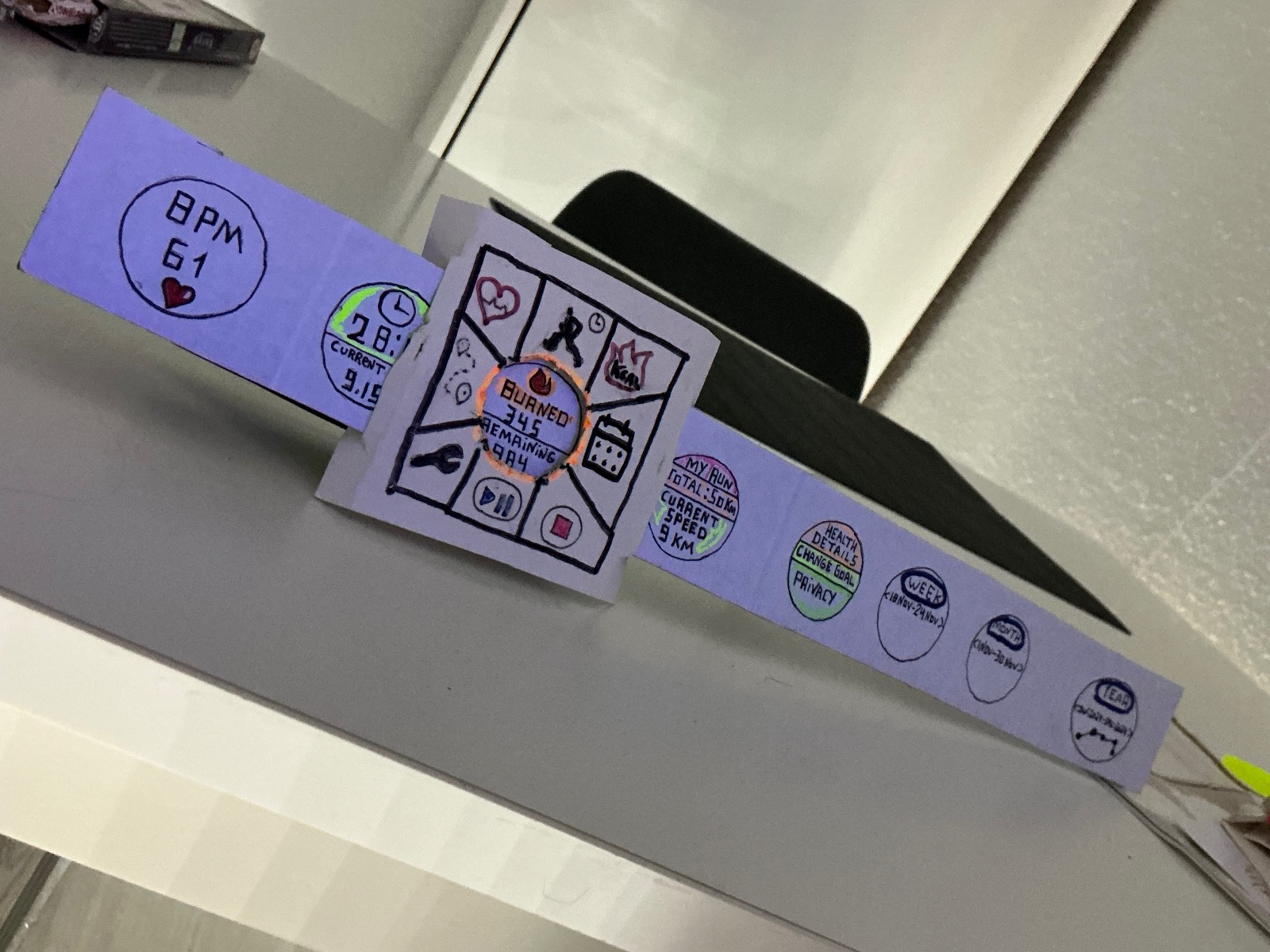
After the first round of paper prototype testing, here are some improvements:
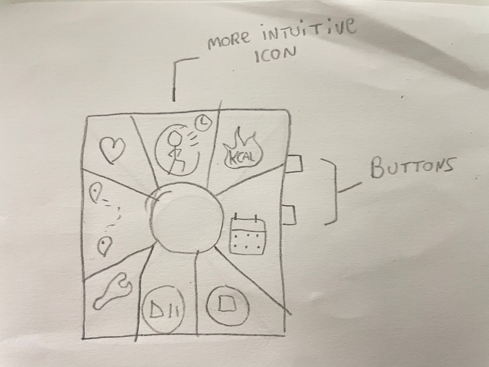

Based on user feedback, I made several changes: reduced color intensity for simplicity, resized icons for better visibility, added clearer interaction cues, and emphasized side buttons. Features like Bluetooth/music were not included yet due to complexity.
Usability Test Result
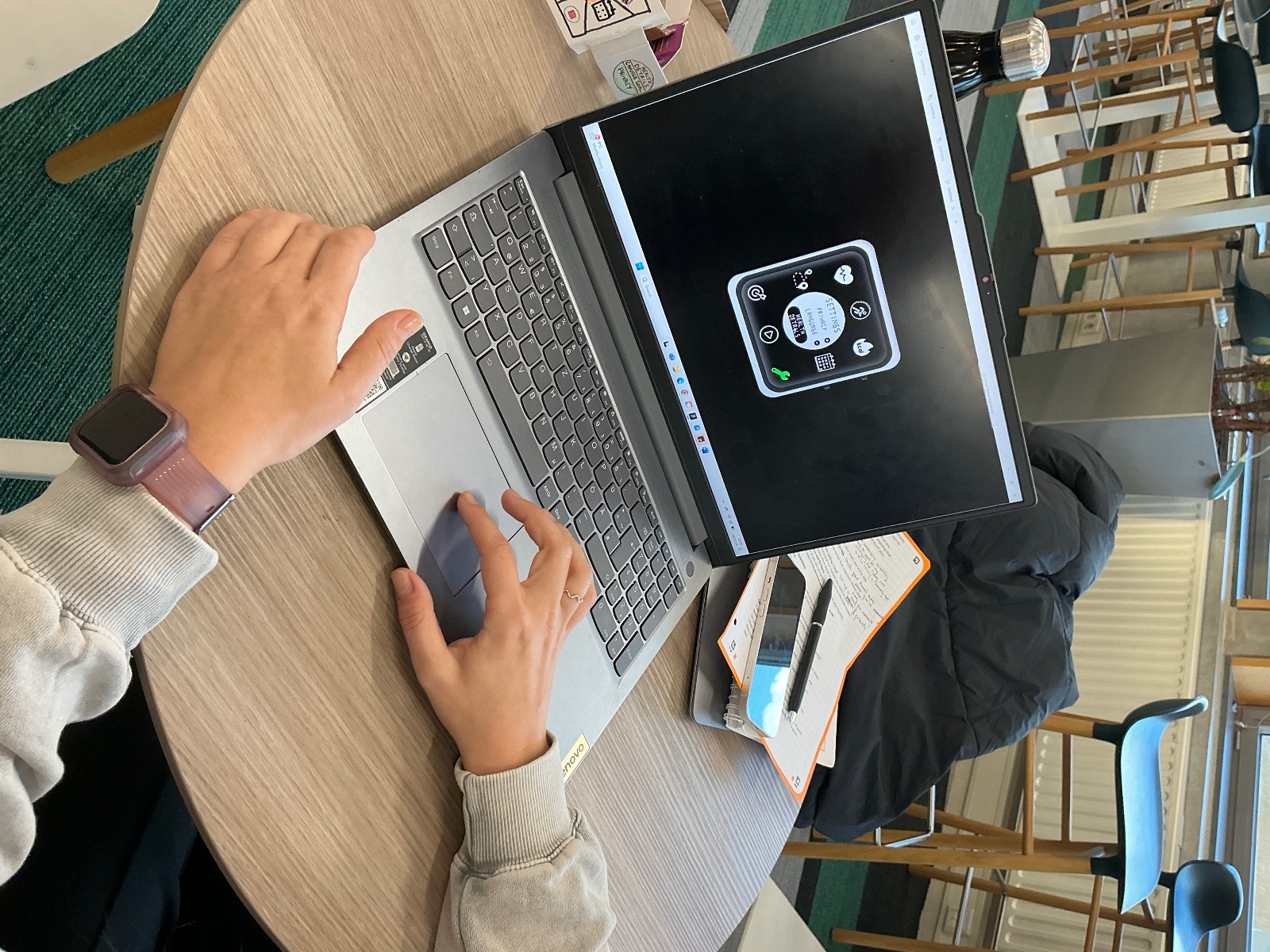
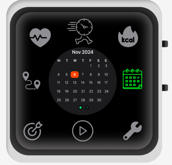
From the testing session, I learned that while users appreciated the overall design, many found the "Time Spent Running" icon confusing, which caused hesitation when interacting with the feature. Their feedback highlighted the need for more intuitive icons and clearer navigation. As a result, I revised the icon to improve clarity and usability. One tester also recommended using a consistent font for titles and a different one for content, which enhanced readability across the interface.